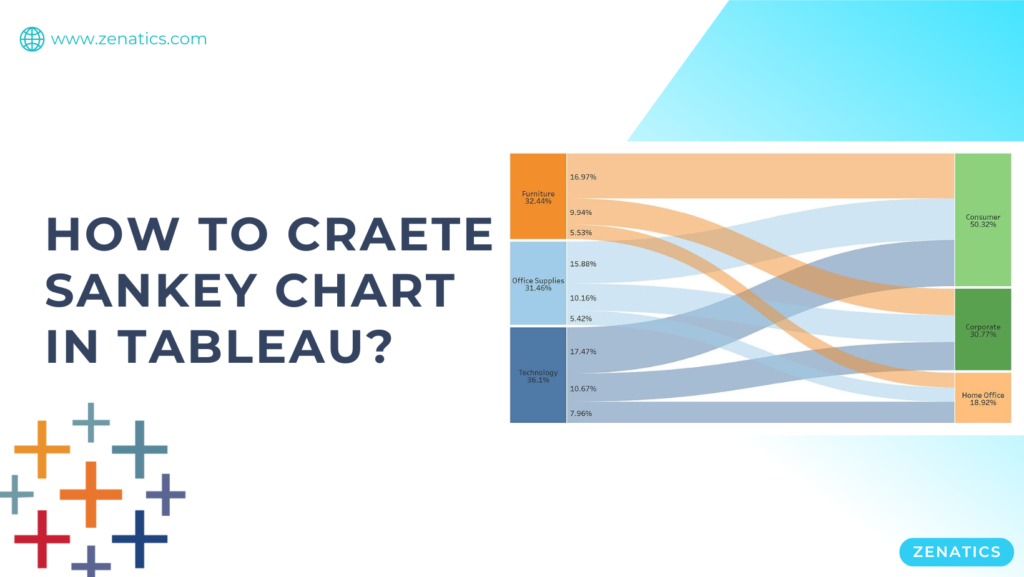
Sankey charts are the best charts to visualize flows or to show relation between entities. Sankey chart provides a clear representation of how values or data move from one set of sources to a set of targets. Sankey chart in Tableau is not not directly possible since Tableau does not offer a native Sankey chart. However, with some data preparation and some advanced Tableau techniques, you can create Sankey chart in Tableau. Before we proceed first understand what is Sankey chart.
What is Sankey Chart?
Sankey charts are great visualizations that shows the display of flows. Through linked lines, a Sankey chart illustrates the directed flow of operations and processes from a starting point to a destination. The connecting lines’ thickness or width relates directly to the flow rate. The value of the matching pairing in relation to other values in the data determines the width of each connecting line.
Sankey charts are best used to show customer journey or customer flow from activation to purchase or to compare how customers changed from last year vs this year or understand the movement of stock in a supply chain or to show website traffic flow. Above are some of the applications of Sankey chart but there are many more applications of Sankey chart.
The Future of Work in India: Trends, Challenges, and Opportunities
How to create Sankey chart in Tableau?
Step 1: Prepare your data
Tweak your data in a proper way to create the Sankey chart. For example, if you are planning to show customer migration from last year to the current year, then you create a table with a field to separate this year’s data from last year. Similarly, in any data set, you should have a column that should be ideal to split the data. Here I am taking superstore and for the demo purpose I am combining both the data (union). Here we need this is because we need the “Table Name” field computed automatically by Tableau after a union.
Step 2: Create calculated fields
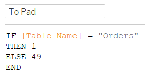
To draw the smooth curves of the Sankey chart, you need to create several calculated fields in Tableau. Create the first calculated field, “To Pad.” The numbers are between 1 and 49 to create the connections in the Sankey chart; don’t enter a very large number since it may cause performance issues.
Step 2.2: Create bins for the the field “To Pad” – We will need to create a bin in order to fill the gap between 1 and 49.
Step 2.3: Create another calculated field “T” – This calculated field is to assign an index to each data point to make sure the Sankey mark can be spread out across the view. Use the below equation to create the calculated field
(INDEX()-25)/4Step 2.4: Create 2 similar calculated fields “Rank 1” and “Rank 2” – Make a calculated field to calculate the running total of the desired metric (sales in this case), divided by the total amount of sales. Once more, there’s no need to be concerned about the “default table calculation” setting. Tableau will learn the beginning and ending points of the Sankey chart from these computations.
# Rank 1  - Use the below equation to create first column
RUNNING_SUM(SUM([Sales]))/TOTAL(SUM([Sales]))

# Rank 2  - Use the below equation to create second column
RUNNING_SUM(SUM([Sales]))/TOTAL(SUM([Sales]))
Step 2.5: Create the calculated filed for sigmoid – In Tableau you don’t have to write down the whole sigmoid expression, instead you can use the below expression.
# Create the sigmoid calculated field using the equation below -
# Column Name = "Sigmoid"
1/(1+EXP(1)^ -[T])
Step 2.6: Calculated new fields as “Curve” – Combine all the calculated fields we have created in the previous steps to create a new calculated field. Use the below equation to create the new calculated field

Step 3: Now drag the calculated filed ‘T’ and ‘Padding’ to the view
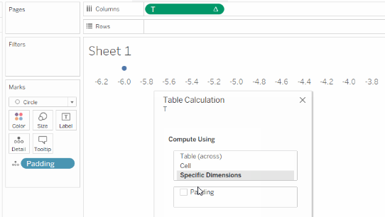
- Drag “T” to column shelf and padding to detail in the Mark shelf. From the drop down change your mark to circle.
- Set up the “T” field to compute based on the padding. After performing a right-click on “T,” select “Edit Calculation,” then select “Specific Dimension” and enable padding. Following the modification of the computation’s configuration, 49 marks should appear rather than 1.
Step 4: Start creating Sankey chart
- Since you already added “T” to column shelf and “Padding” to detail, now add “Curve” to the Row shelf.
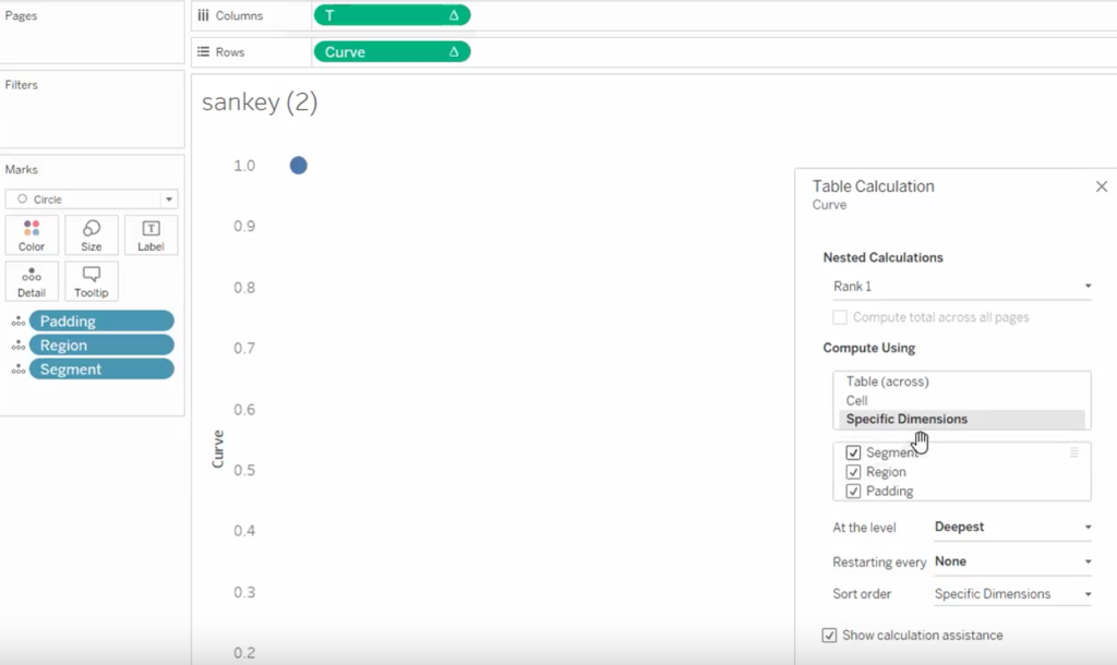
- In the next step Configuring the “Curve” table calculation here, we are using the columns Segment and Region. Thus, those two dimensions will be dragged into the details shelf. and set them up appropriately. This is a crucial section since it will determine how your Sankey chart will appear.
- When you right-click on the Curve field and select “Edit Table Calculation,” a line labelled “Nested Calculation” will appear. This is where we set the parameters for the sankey’s movement.
In the nested calculation select Rank 1 first, then select ‘Specific Dimension’ and arrange in the below order.
Now, select “Rank 2” in the nested calculation and arrange in the below order.

The above chart has some references to a Sankey chart, but it doesn’t exactly look like one—we’ve only finished 60% of it. To make it resemble a Sankey chart, add path and color.
1. Select path from dropdown
2. Drag Region to color
3. Drag Padding to path
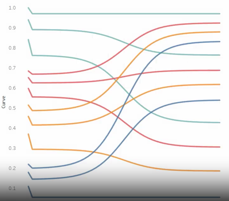
Step 5: Create the 2 segments of the Sankey chart
Step 5.1 – Open new sheet and drag Region to color and sales into Rows. Right click on sales and change the Sales calculation to a table calculation as “% of Total”. Edit the axis and make it from 0 to 100%. Add proper labels and sort the chart based on Sales and arrange by descending.
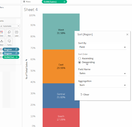
Step 5.2 – Open another sheet and drag segment to detail and sales to row shelf. Change sales to % of total as color so it will now have a diverging color scale.

Step 6: Configure the line and size of Sankey
Step 6.1 – We have all the 3 necessary sheets for the Sankey chart now have to edit the Sankey to look better. Range of the Sankey needs to be between -5 to 5 on X axis (T). As for the Y axis (Curve), we must sort the dimensions in the same way as the two sheets before it. We constructed. The range from 0 to 1 must be fixed, and the axis must be reversed.
Step 6.2 – Create the calculated field to resize the Sankey using the below equation –
# Calculated field to resize the Sankey
# Filed name - Sales Sizing
WINDOW_AVG(SUM([Sales]))
Step 6.3 – Drag ‘Sales sizing’ into size shelf. Right click –> Edit table calculation –> Specific dimension –> Select Padding
Step 6.4 – Now increase the size of the lines and your Sankey chart is 80% ready.
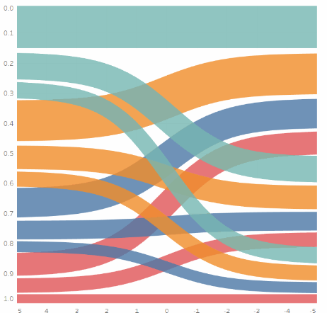
Step 7 – Final step to create the Sankey chart in Tableau
- Go to dashboard and add all 3 sheets together.
- First chart should the region bar chart then the Sankey and final chart should be the segment bar chart.
- Now your Sankey chart is ready.
- Note –
Hide the sheet title from all the charts and make sure stacked bar chart size is full
Though it takes some ingenuity and sophisticated techniques to create a Sankey chart in Tableau, the results can offer profound insights into your data flows. You can create a customized Sankey chart to see intricate relationships and movements in your data by following these steps. Enjoy your visualization!